
|
In product photography, lighting is the unsung hero that can make or break a shot. Over the past twenty years, advancements in technology and shifts in creative trends have revolutionized how photographers approach illuminating their subjects. From the traditional studio setups to the advent of LED panels and sophisticated software, let's embark on a journey through time to explore the innovative evolution of lighting in product photography.
The Traditional Studio Setup: Two decades ago, product photographers primarily relied on conventional studio setups comprising strobe lights, softboxes, and reflectors. These tools provided a controlled environment where light could be manipulated to highlight textures, shapes, and colors of the product. However, this approach often required extensive expertise and meticulous adjustments to achieve the desired results. Despite its effectiveness, the traditional setup limited creativity and flexibility in capturing dynamic product shots. The Rise of LED Technology: As technology progressed, the introduction of Light Emitting Diode (LED) lighting systems marked a significant turning point in product photography. Unlike traditional strobes, LEDs offered several advantages, including lower power consumption, adjustable color temperature, and compact size. These features revolutionized the way photographers illuminated their subjects, allowing for greater mobility and versatility. Moreover, the consistent and flicker-free output of LED panels ensured uniform lighting, resulting in enhanced image quality and reduced post-processing efforts. Embracing Natural Light: In recent years, there has been a resurgence of interest in using natural light as a primary source of illumination in product photography. This shift is fueled by the desire for authentic and organic visuals that resonate with consumers. By harnessing the beauty of natural sunlight, photographers can create compelling images that evoke emotions and tell a story. Additionally, advancements in light-modifying tools, such as diffusers and reflectors, enable photographers to harness the full potential of natural light while maintaining control over shadows and highlights. The Role of Post-Processing Software: Alongside technological advancements in lighting hardware, post-processing software has played a crucial role in shaping the landscape of product photography. Tools like Adobe Photoshop and Lightroom offer photographers a plethora of creative options to fine-tune lighting, colour, and contrast in their images. Through techniques such as dodging and burning, photographers can further enhance the visual impact of their product shots, achieving a balance between realism and artistic expression. Adapting to Changing Trends: In the fast-paced world of product photography, staying abreast of changing trends is essential for success. With the proliferation of e-commerce platforms and social media channels, photographers are tasked with creating visually captivating images that stand out in a crowded digital landscape. From minimalist compositions to bold and vibrant lighting schemes, photographers must continually innovate and experiment to capture the attention of their audience. Conclusion: The evolution of lighting in product photography over the last twenty years has been nothing short of extraordinary. From traditional studio setups to cutting-edge LED technology and the resurgence of natural light, photographers have embraced innovation to elevate their craft. As we look towards the future, one thing remains certain: lighting will continue to play a pivotal role in shaping the visual narrative of product photography, inspiring creativity and pushing the boundaries of what's possible. In the digital age, where attention spans are short and competition is fierce, businesses must find innovative ways to connect with their customers. One powerful tool that has emerged as a game-changer in marketing is visual storytelling, and at the heart of it lies photography. Visual storytelling goes beyond traditional advertising tactics by creating narratives that resonate with audiences on a deeper level. It's about weaving a compelling story through images that evoke emotion, spark curiosity, and forge meaningful connections. Photography, as a visual medium, is uniquely positioned to convey these narratives effectively. A well-crafted photograph has the ability to capture the essence of a brand, communicate its values, and leave a lasting impression on viewers. One of the key advantages of visual storytelling through photography is its universality. Images transcend language barriers, allowing businesses to connect with diverse audiences across cultures and geographies. Whether it's a striking product photo or a behind-the-scenes snapshot of your team, visual storytelling speaks a universal language that resonates with customers worldwide. Moreover, visual storytelling through photography fosters authenticity, which is increasingly valued by consumers in today's marketplace. By showcasing real people, real experiences, and real moments, businesses can build trust and credibility with their audience. Authenticity breeds loyalty, and loyal customers are more likely to become brand advocates, spreading the word about your business to their networks. Furthermore, visual storytelling enables businesses to differentiate themselves in a crowded market. In a sea of generic stock photos and cookie-cutter marketing messages, authentic and compelling imagery stands out like a beacon, attracting attention and driving engagement. Social media platforms, in particular, offer fertile ground for visual storytelling through photography. Platforms like Instagram, with its emphasis on visuals, provide businesses with an opportunity to showcase their brand story in a visually captivating way. From curated feeds to Instagram Stories, businesses can leverage photography to create immersive brand experiences that captivate and engage their audience. The power of visual storytelling cannot be overstated. By leveraging photography to convey compelling narratives, businesses can forge deeper connections with their customers, foster authenticity, and differentiate themselves in a competitive marketplace. So, if you're looking to make an impact with your marketing efforts, harness the power of visual storytelling and let your images do the talking. ------------------- Full disclosure, I asked ChatGPT to write this article based on parameters I provided. I agree completely with everything within. The Power of a Functioning Computer in My Photography Business
In my world as a photographer and business professional, a functioning computer isn't just a convenience – it's an absolute necessity. From editing photos to managing client interactions, my entire workflow is seamlessly tied to this electronic companion. It's the tool that transforms raw images into the polished photographs that define my work. Beyond the creative side, my computer handles the day-to-day operations of my business, from financial transactions to client communications. In essence, it's the silent partner that ensures the smooth functioning of my photography endeavors, playing a crucial role in every aspect of my professional journey. When this amazing piece of technology falters, well... I start to question my sanity. Sometimes I wish that I wasn't as reliant on this machinery. I'd love to hear your thoughts on such matters. If you were to go back to 1993, you might see me at my college computer room banging away on a candy-coloured blue or orange iMac computer. Back then, those machines were state of the art for any college in Canada, and Sheridan College/Oakville had dozens of them.
We were learning the handful of Apple applications as well as Adobe offerings as they pertained to working with images. Adobe Photoshop, Illustrator, and maybe a little Corel Draw were the time wasters of the day. Back then we all had a personal Zip drive along with the required handful of zip cassettes for storing all our projects. They were modern and cool looking but not without their idiosyncrasies. Practically every time I would have a big image to complete, there would be a problem caused by a mysterious gremlin hiding in the Mac. Almost without fail, if I pressed CMD+S to save my sub-GB file to the Zip drive, it would crash. Practically every time. It was so annoying. I'm not sure how we got through those episodes of dramatic events but we were able to get the work done and deliver to the professors on time or just after it was due. I don't miss those annoying Zip drives or the drama-queen blue or orange Mac computers. The "kids" these days will never have to experience those foibles, trials and tribulations. Mind you, I'm sure they have their own issues to deal with when it comes to technological failures that make you want to scream into a pillow in frustrated rage. These days we have come so far it amazes me. The technology is so advanced and practically sentient. What will our grandchildren have to deal with when THEY are in college ? Will they even have personal computers to deal with ? Will they want for anything ? Will my prediction of a personal built in computational device implanted at birth come true ? Will Artificial Intelligence meld with the human mind, making our need for monitors and keyboards a thing if museums and stories around a camp fire ? I'll never know. Maybe my kids will never know. At the moment, AI is fascinating to me. I hope that it never becomes frightening to me. You've heard from those real estate gurus, "location location location". I'm contemplating this thought as it might pertain to photography. Would you agree or disagree ? No I don't mean that for a general photographer who shoots anything and everything, I mean for those of us who are concentrating on shooting for businesses. Would you agree that it would be pertinent and in fact vital for success to set up shop where the majority of businesses whom might need a photographer ? If you were selling ice cream, it probably would be more beneficial to set up shop near a tropical beach resort, rather than a ski hill. Right ? It kind of goes without saying. You've got to be where your customers expect to find you. I still believe that it is easier to solve a problem that already exists than to make something for an unknown buyer. Taking away a pain either for a business or a person, will always prove more prosperous. Living here in Peterborough still gives me room for thought about wether staying in such an obvious suburban community is a good choice for a small business such as mine. Sure, I'm just 90 mins from the GTA and could certainly take on jobs there. But the fact remains that I am somewhat removed from where a much larger market exists. On the other hand, I'm also somewhat removed from a significant level of competition. Here in Peterborough, there are a handful of photographers to be sure. However the majority, I would say 9 out of 10, are not concentrating their efforts on the business clients. They shoot pictures of kids, families, parties, dance recitals, weddings etc. That's not for me. Giving it more thought. Taking my time. No rush. We'll see where my instinct takes me in the coming months. Meanwhile, for those who need product, processes and people doing their thing. I'm your man 'round these parts.  In the heart of every manufacturing enterprise lies a story waiting to be told. Beyond the hum of machines and the precision of processes, there's a narrative that connects with clients, partners, and stakeholders. This narrative, often overlooked, is a powerful tool that can be harnessed through the lens of commercial photography. The Tale of Craftsmanship Consider this: a series of expertly captured images that showcase the intricate details of your manufacturing process. From the skilled hands shaping raw materials to the state-of-the-art machinery in action, each photograph tells the tale of craftsmanship that sets your business apart. These visuals not only elevate the perceived value of your products but also demonstrate the commitment to quality that defines your brand. Building Bridges with Clients Establishing and nurturing client relationships is paramount for any manufacturer that wishes to grow. Professional photography provides a unique opportunity to bridge the gap between your clients and your production facilities. Imagine the impact of sharing a visually compelling story of how their orders are meticulously handled, assuring them of the dedication and precision that goes into every product. Cultivating a Culture of Excellence Every manufacturing facility has a culture, a set of values that guide its operations. Photography becomes the silent storyteller of this culture, capturing moments that reflect the dedication, teamwork, and innovation within your organization. These images, when strategically incorporated into your branding, become a visual representation of the excellence embedded in the very fabric of your business. Visual Consistency: A Branding Symphony Consistency is the backbone of effective branding. Through professional photography, you can orchestrate a symphony of visuals that harmonize across your marketing channels. From your website to promotional materials, this consistency reinforces your brand identity. Potential clients encountering your brand will find a narrative that resonates, creating a lasting impression that goes beyond the products you manufacture. Navigating the Digital Landscape In today's digital era, the battle for attention is waged on screens. Investing in high-quality commercial photography equips your business with a powerful arsenal to navigate this landscape. Striking visuals capture the interest of your online audience, prompting them to delve deeper into your story. Whether on social media, your website, or marketing campaigns, these images cut through the noise and leave a lasting imprint. The ROI Equation: Beyond Numbers While the impact of commercial photography is undeniable, measuring its return on investment goes beyond mere numbers. It's about cultivating an image that translates into increased client trust, strengthened relationships, and enhanced brand loyalty. These intangible benefits eventually manifest as increased profits, as clients are not just buying products; they're investing in the story, the culture, and the values your brand represents. In conclusion, the investment in commercial photography is not just a line item in the budget; it's a strategic move to weave a compelling narrative that resonates with your audience. By bringing your manufacturing story to life through visuals, you're not only boosting your brand but also laying the groundwork for sustained profitability. It's a journey that begins with a click of the shutter and ends with a visual story that echoes in the minds of your clients, creating a narrative that transcends the tangible and drives your business towards greater success. 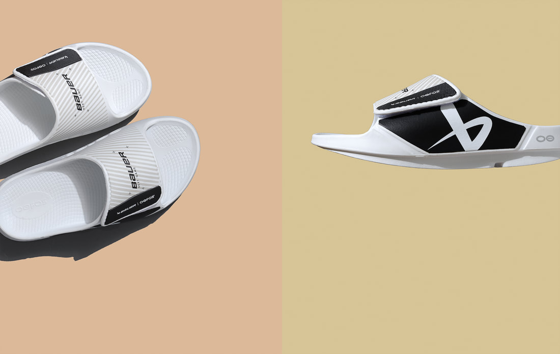 Capturing Corporate Excellence: The Impact of Professional Photography on Business Branding1/18/2024
In the fast-paced and visually driven world of business, the first impression is often the only impression. As companies strive to stand out in crowded markets, the role of professional photography in shaping a brand's identity has never been more crucial. Beyond simply showcasing products or services, commercial photography has the power to capture the essence of corporate excellence, leaving a lasting impact on clients and customers alike. Visual Storytelling: A Gateway to Corporate Identity Imagine your business as a story waiting to be told. Professional photographers excel in weaving visual narratives that go beyond mere snapshots. They have the ability to portray the values, culture, and unique selling points of your company through carefully crafted images. These visuals become a language that resonates with your audience, providing them with a glimpse into the heart of your corporate identity. Building Trust and Credibility In the corporate world, trust is the cornerstone of successful partnerships. High-quality, professionally taken photographs lend an air of authenticity to your brand. Clients and customers are more likely to trust a business that invests in visually appealing content. Whether it's showcasing your team, premises, or the behind-the-scenes processes, professional photography creates a transparent and trustworthy image that fosters stronger connections with your audience. Setting the Tone: Consistency in Branding Consistency is key in branding, and professional photography plays a pivotal role in maintaining that consistency across various platforms. Whether on your website, social media profiles, or marketing materials, cohesive visuals create a unified brand image. This uniformity not only reinforces brand recall but also establishes a sense of professionalism and reliability. Standing Out in the Digital Landscape In an era dominated by digital content, businesses are constantly vying for attention online. Professionally captured photographs have the ability to cut through the digital noise, making your brand instantly recognizable. High-resolution images that are visually striking not only grab attention but also encourage engagement. As users scroll through countless posts and advertisements, captivating visuals can be the difference between being noticed or overlooked. Investing in Long-Term Success While it may be tempting to cut costs, investing in professional photography is an investment in the long-term success of your business. Quality images have a timeless appeal and can be reused across various marketing campaigns, saving both time and resources in the long run. In conclusion, the impact of professional photography on business branding is undeniable. It goes beyond aesthetics, playing a fundamental role in shaping how your company is perceived. By investing in capturing corporate excellence through photography, you're not just creating images; you're crafting a visual identity that resonates with your audience, fosters trust, and propels your brand towards lasting success.  I asked AI to write an article that compares the differences between the lenses of cameras vs mobile phones, and this is what it came up with in less than 30 seconds. It's very through, except for completely missing any mention of technical lenses for architecture, product or aerial photography.
Camera lenses and mobile phone lenses share some similarities, but there are also key differences in terms of design, construction, and functionality. Here are some technical differences between the two:
I suppose dear reader, you could take this in more than one way. For example, since I make images almost every day, editing is paramount to strengthening my portfolio. When I pull images out of the line up, I do it because they don't blend with the overall aesthetic of what I'm presenting to the world, even though at the time I made them they may have. I pull certain images in order to strengthen instead of dilute my message. Every now and then, I look through my website from the point of view of a newcomer and ask myself, "does my portfolio make sense?". "Is what I'm seeing a coherent message or is the message a jumble of disassociated individual images". A jumble of images makes for a weak and unmemorable experience for the viewer. This is where editing and culling poor images becomes important. If you are talking metaphorically, one could edit their circle of influence, their relationships with people they commonly associate with. As the saying goes, you are the average of the 5 people you spend the most time with. I may have the number skewed a tad, but you get my point. If those 5 people are low energy, lethargic and always bring you down, you would do better to edit your crowd in order to improve your chances of happiness and prosperity. Editing is a good thing and should be taken on without hesitation. Thinking of reducing your crowd of influence should never be thought of as a negative action. On the contrary, doing an inventory and analysis of what improves and what degrades your life is an essential skill. You may even go as far as to conduct an 80/20 analysis to home in on what exactly is making your life better, and what is simply draining your resources. As a photographer, I take editing quite seriously. One substandard image may be the only thing a portfolio is remembered for in a sea of gems. It only takes one sour candy to ruin a delicious cheesecake. Never be afraid to edit. You'll be stronger for it in the long run.   Making a cool image out of a collection of bits and pieces is sometimes the name of the game. Even if I'm doing it solely for my own uses.
My portfolio consists of a number of personal projects that give me the opportunity to build my skills as a problem solver as well as a creative photographer. Each shot has its challenges. Technical and creative. Recently I took on the challenge of shooting this protective hockey equipment, not knowing how I was going to achieve my goal. Each job as I said, has its challenges. With experience comes knowledge and confidence. Each successive project build on the knowledge of the previous and gives one the ability to work faster and with more confidence. I think that applies to more than just the photography world. As we slip into a new year, I'm looking forward to getting my hands dirty with a new genre of product shooting. Let's see what I can achieve with even more challenges. |
Mike Taylor
Photo-Artist working a personal vision. Archives
July 2024
Categories
All

For those of us interested in better marketing techniques, get this book.
Mike Taylor Photo Arts
205Wilson Street
Peterborough
ON
K9J 1S7
Canada
|
 RSS Feed
